Showing posts with label L.A. Arboretum. Show all posts

Thursday, January 7, 2016

Color at the Arboretum

The beginning of a new year, and it's about time I updated here!

First, I'll share some work that follows up on my studies of Notan (harmony of light and dark) that I shared here after my Urban Sketchers Singapore workshop...time to work on color!


I did a workshop in November called the Harmony of Color at the Los Angeles Arboretum.  I believe that strong color work really needs a solid understanding of values, and I've noticed that sketchers often struggle with this when working with color.  It's so easy to get caught up in "local color", and miss the rich range of values that you're seeing.  So, I began with monochromatic studies...


I think the best place to start with color is with seeing "color temperature", so I did some studies in complementary warm and cool colors...


I started by painting the cool shadows of the Queen Anne Cottage and surrounding foliage with ultramarine blue watercolor...


Next, I used pyrrol orange (very  brilliant reddish orange!) as the complement to blue.  I wanted the cool blue to predominate, so I tried to be selective with the orange.  Just as in Notan painting, I try to be mindful of the pattern I'm creating as I work...


Then, I thought I'd experiment to see what would happen if I started with the warm color, pyrrol orange, and then added the complement of blue...I frankly found that confusing, and here the warm and cool are battling it out for dominance!  I added yellow to make a sort of triad (3 colors that are equidistant on the color wheel).  So, even if it's not completely successful, it's something to learn from!

My next step was to experiment some more with triads...and made some variations on the primaries.  While I was added I did some other complementary combinations, like violet/yellow.  There are endless possible variations, and I have more experimenting to do!


My next triad study started with painting shadows in cobalt blue...


Then adding layers of hansa yellow light and pyrrol orange--fun to see the range of greens emerge...


Some more color studies at the Arboretum...starting with some quick thumbnails...


And some larger color studies...


Thursday, August 13, 2015

Harmony of Dark and Light...

Planning my workshop for the Singapore Urban Sketchers Symposium actually began many months in advance.  I've been giving a lot of thought to what makes a sketch (or perhaps any artwork) a success--and it seems to me that it's composition--a dynamic composition has the power to grab the eye and hold it!  Without a strong composition a great idea or lovely rendering just doesn't come across.

In studying composition, I began reading about Notan--a Japanese word meaning the harmony of light and dark.  There really isn't a word in English that means quite the same thing.  Suddenly a light came on for me, as I saw how well it could work as a way to create strong compositions by first seeing shapes of light and dark in a subject, and then composing those shapes on a page.

So--how does this relate to sketching on location?  Composing with Notan begins with seeing the patterns of light and dark in your subject--such as light and shadow on a building surface or foliage, but it means much more than that.  As you develop your sketch, what becomes important is the harmony of tones--how the lights and darks are balanced on your page.  In other words, you make choices of what to "push" as you interpret and compose the patterns of light and dark that you see.

My first workshop using this idea was at the Los Angeles Arboretum with its lovely Queen Anne Cottage, enormous palm trees, and a wonderful variety of birds everywhere.  I took participants through a process of 3 steps:  creating a pattern of black and white, then adding a mid-value wash to follow the rhythm of the black and white shapes and add some depth, and then the final step of adding a punch of color for fun--and emphasis.

So, here are some of the sketches that I did at The Los Angeles Arboretum...


Initially I began with line...then adding, massing shapes with a black brush pen...


With practice, I began jumping in with the brush pen, to commit to the large shapes right away...
Then, adding a mid-value wash...


And finally, adding color for emphasis--doing this selectively.  At this point, I ask--Where do you want to draw the eye?  Notice how color can become another element to lead the eye in your composition...


Sunday, July 28, 2013

Urban Landscape

I enjoy drawing just about every aspect of the city, especially
the physical landscape--the land and trees as well as the people,
cars and the built environment that make up an
urban landscape.  Whether it's a bit of cultivated landscape,
like the Los Angeles Arboretum...


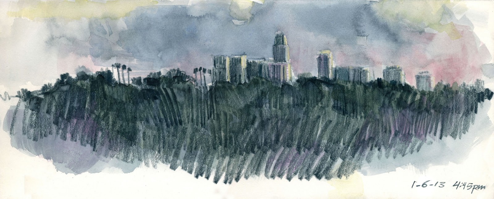
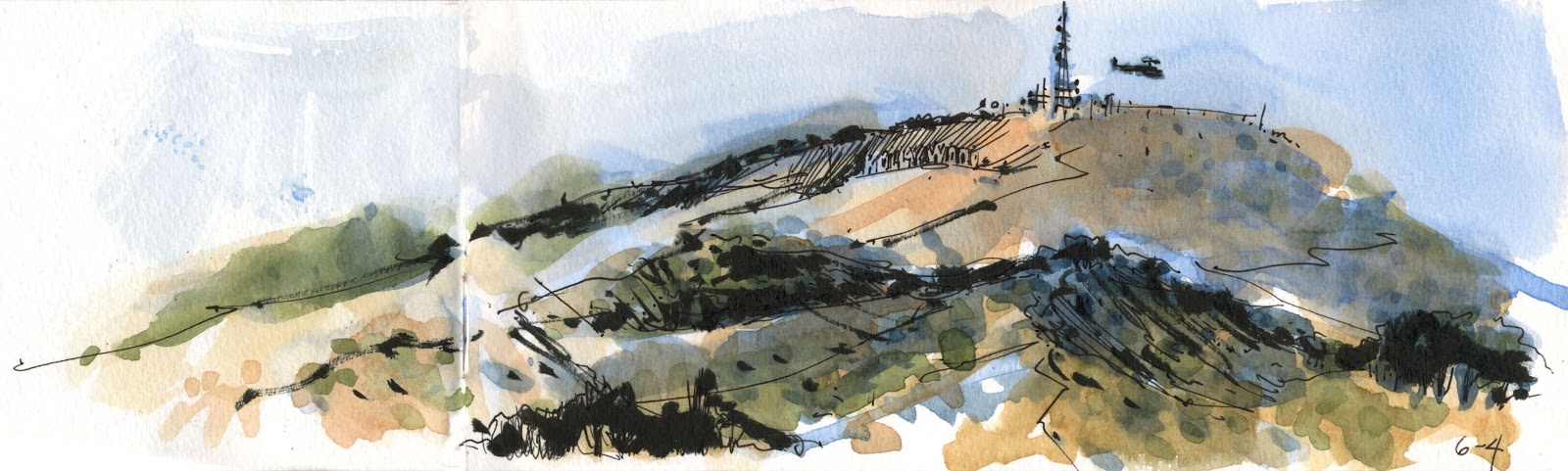
...the hills of Northeast Los Angeles at different times of day, or the landscape of a parking lots...I look for the passages of light and shadow...


I like the sometimes weird mash-up of signs, cars and buildings in Los Angeles, like this little
landmark on Hollywood Blvd., Machos Tacos...

I began thinking seriously about panoramic views  
in anticipation of teaching workshops...
what makes the eye move across the page, 
or draws the eye in...
A quick view of downtown Los Angeles at dusk, and views from Barnsdall Park, 
Griffith Observatory and the Santa Monica Pier...


Wednesday, June 1, 2011